plus/minus epsilon
Wrapping my Head Around Bonds
6 Feb 2022I’ve been learning about bonds and wanted to do some simulations and look at real data to try to understand them better.
There are two basic investment strategies with bonds:
- A growth strategy where we generally leave the portfolio alone and re-invest any coupon payments back into similar bonds. I modeled this in a really complicated way trying to capture the actual cash flows that bonds produce, but the end result is that the annualized growth of the portfolio is the same as the yield-to-maturity of the bonds you invest in.
- An income strategy where we consume some portion of the coupon payments from the bonds in our portfolio instead of reinvesting them, or even (towards the end of the portfolio’s life) start selling bonds for cash income. Again, I modeled this in a really complicated way but it ended up being the same as just assuming that every year you get a generic X% increase in principal and subtracting the desired income, and repeating that until you run out of money.
In terms of looking at actual bonds that are for sale, I think an interesting choice would be tax-exempt San Francisco municipal bonds. There’s actually a lot of them for sale (about 150) with a lot of different properties, but it also seems like it should be a small market. And the fact that they’re tax-exempt makes thinking about their return a lot easier! We can start by graphing their yield curve:
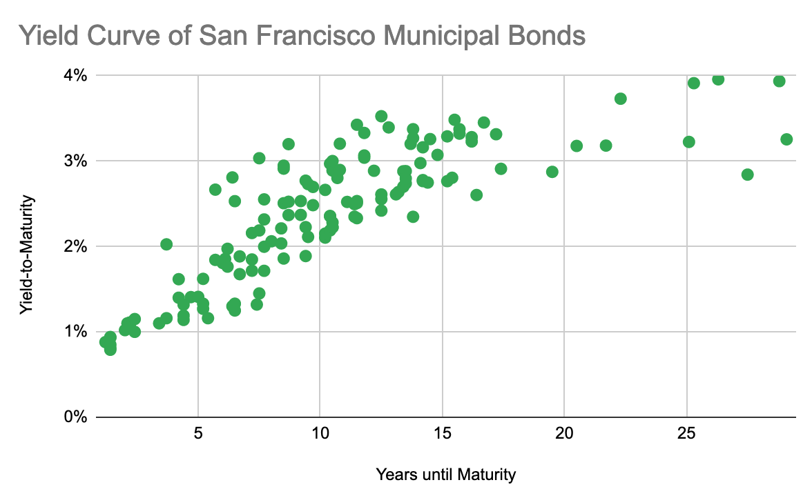
And… It looks pretty typical? It slopes up with some noise around longer maturities but that doesn’t really tell me anything.
Digging further: let’s pretend that we wanted to buy one of these to follow an income-generating strategy. Which would we choose? If we were investing in the stock market, we’d get a 7% average return and it would be nice to find something competitive here. Since these are tax-exempt, the yield we need to compete with a 7% taxable return is 0.07*(1-0.35) = 4.55%. While looking at the graph above shows there aren’t any bonds with a yield-to-maturity this high, there may in fact be bonds with a current yield this high – that is, bonds with a high ratio between their coupon payment and their market price.
Searching for such bonds shows in fact, yes! The highest current yield bond for sale is 4.76%! That would work great – but what’s the catch? This particular bond, which was issued in 2016 by SFO to refinance other debt, matures in May 2023 which means you’d get maybe 3 coupon payments from it before it matured, and the yield-to-maturity of this bond is… 0.88%. So in reality it’s not much better than just keeping your cash in the bank and consuming it directly. Let’s graph current yield versus yield-to-maturity to see if there’s a larger pattern of the two being inversely correlated,
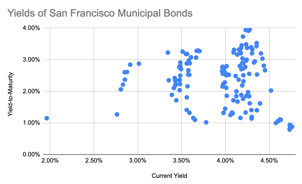
And in fact there is a pattern! But it wasn’t what we were looking for. Current yield and yield-to-maturity aren’t correlated but the graph has several distinct clusters. Searching for controlling variables shows that the clusters are related to the coupon rate:
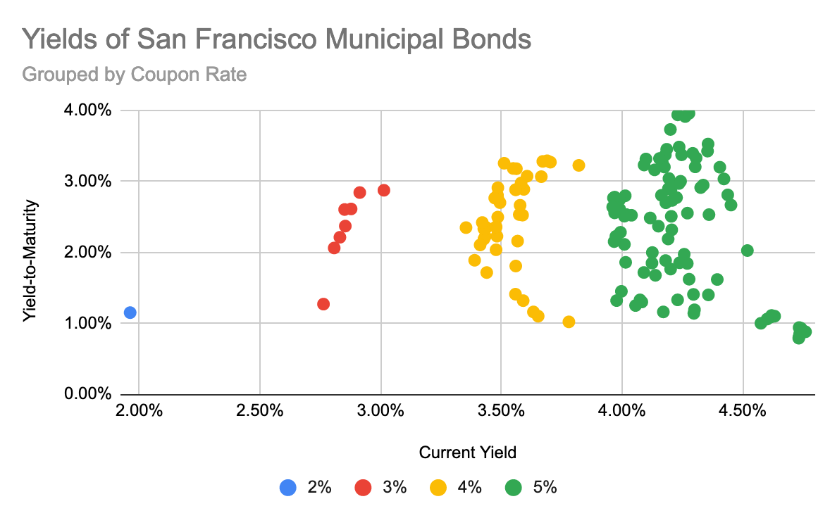
It looks like on average, if the coupon rate increases by X% then the current yield increases by X%. But current yield = coupon / price, which means the price of the bond is independent of the coupon rate… which isn’t how that’s supposed to work. Directly graphing the coupon rate vs the price shows that there is a slight positive correlation, but it’s much weaker and noisier than the same graph for a random selection of high-yield corporate bonds (even accounting for differences in maturity).
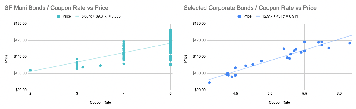
What further confuses me is that the pricing formula for bonds also predicts a stronger relationship between coupon rate and price for a low yield borrower like San Francisco than a corporation. And given that in the market for SF muni bonds, the city isn’t being properly compensated for higher coupon payments, I don’t understand why they continue to issue them. So basically I don’t know what’s happening here, but moving on:
The original graph showed us that we can have bonds with a high current yield and a high yield-to-maturity, so let’s find one of those!
The next one I picked was issued by SFO in 2018 to fund capital improvements. It has a current yield of 4.28%, a yield-to-maturity of 4.00%, and matures in 2048. This also seems like it would be a great choice! At face value, it would produce an income stream rivaling even stock market returns, with very little risk, for the next 26 years. So what’s the problem now? This one is callable, which means that the issuer can (and probably will) refinance or pay off the bond early, and a lot of the income we expected won’t materialize.
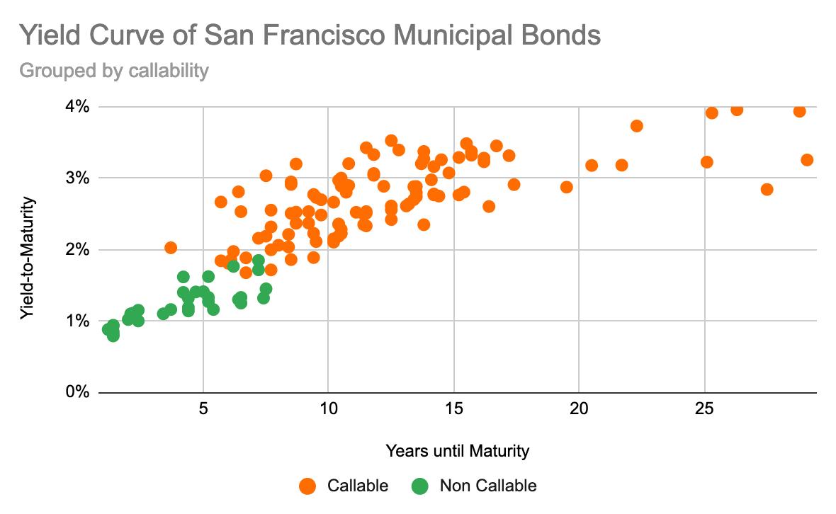
Graphing the yield curve again, but this time coloring by callability shows that there are no non-callable bonds beyond about 7 years and they all have yields below 2%,
At this point, I’m fairly confused about who actually buys this stuff? Searching SEC filings shows a decent amount of institutional ownership in bond ETFs like:
- BlackRock California Municipal Income Trust (BFZ)
- Nuveen California Municipal Value Fund (NCA)
- Northern California Intermediate Tax-Exempt Fund (NCITX)
These all trade for around $10 and issue really consistent dividends in the 2-5% range. BlackRock’s fund is the highest yielding with about a 4.5% dividend, which is curiously higher than any of the bonds we’ve looked at. They’re also the most highly leveraged out of the three listed: almost 40% of fund assets are borrowed. The high degree of leverage helps explain the high return, but it doesn't explain how their own borrowing is funded.